Case study
Clear, human communication for a community that needs to be understood quickly.
Client
SA Society of Ostomates
Sector
Healthcare support non-profit
Services
Brand support + social / digital content
The challenge
A support organisation needed to communicate with people at a vulnerable and often frightening moment, across a small volunteer team and limited resources.
Every post was being designed from scratch, so the tone and appearance shifted constantly and the organisation looked less established than it is.
Our thinking
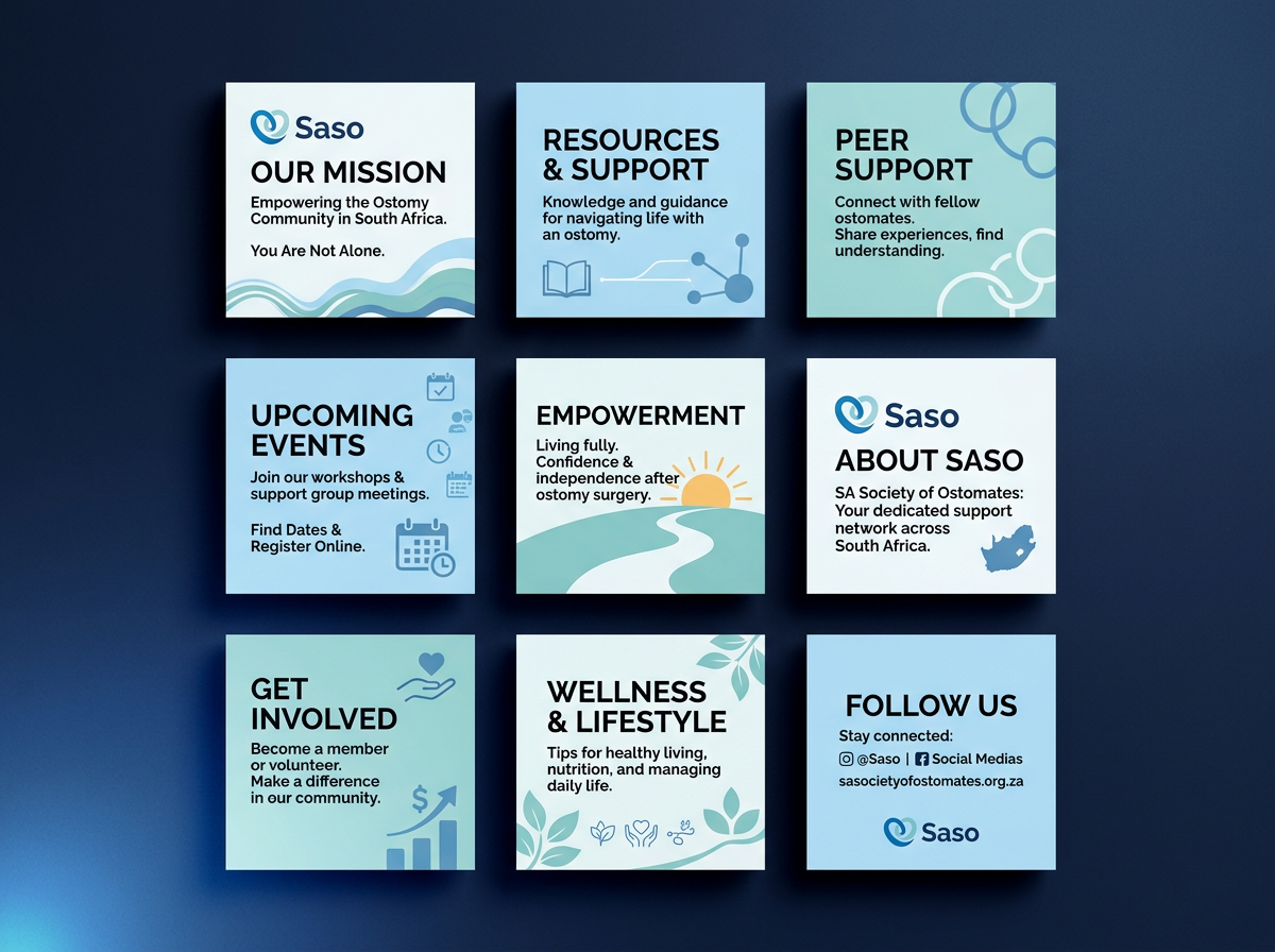
Reassurance comes from consistency. A calm, warm, repeatable visual system does more for credibility than any single beautiful asset.
It also had to be usable by non-designers. If the system is hard to apply, it stops being applied — so simplicity was a functional requirement, not an aesthetic one.
What we delivered
The result
The organisation now presents itself consistently across every channel, and the team can produce on-brand content without design support — which is what makes it sustainable.